If a commodity is ‘good’, then more of it is preferred to less of it. Indifference curves between two commodities which are “goods” slope downward and are convex to the origin.
However, when for a consumer a commodity is a bad’ that is undesirable object, the more of it will lower his satisfaction.
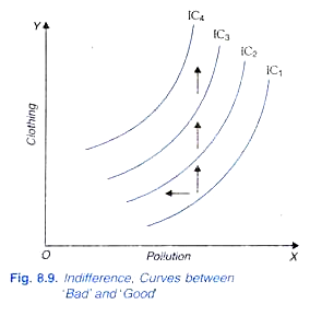
Thus, if a commodity which is bad’ less IS preferable to more. Pollution, risk, tenacious work, and illness are some examples of bads. In the case of bads, indifference curves are of different shape. Suppose a bad (for example, pollution) is represented on the X-axis and a commodity which is “good” is represented on the y-axis, then the indifference curve will be sloping upward (that is, will have a positive slope) as displayed in Figure 8.9.
This is because in this case a movement towards the right along an indifference curve implies more of pollution which will reduce consumer’s satisfaction and, therefore in order to keep his level of satisfaction constant, the quantity of a commodity which is good such as clothing will have to be increased. The direction of preference in this case is upward and to the left.
ADVERTISEMENTS:
An important application of indifference curve analysis in recent years relates to the problem of portfolio selection. Portfolio selection by an individual means his choice of a particular distribution of his wealth among several assets such as equity shares debentures real estate, etc. These different assets yield different rates of return and involve varying degree of riskiness.
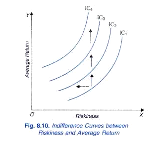
In the analysis of portfolio selection, the average or mean return from a portfolio enters as a “good” or a desired object, whereas degree of risk involved enters as a bad or an undesired object. In Figure 8.10 we depict indifference curves of an investor who wants or prefers high average return and low risk. The higher the average return, the higher the satisfaction of the investor; and higher the degree of risk involved in a portfolio, the lower the satisfaction of the investor.
Therefore, in this case also, the indifference curve between riskiness (i.e., bad) and rate of return (i.e., a good) slopes upward. This is because as we move rightward satisfaction declines due to greater risk and to compensate for the decline in satisfaction due to greater risk and to keep the level of satisfaction constant, rate of return (i.e., good’) has to be increased. It may be noted that direction of preference in this case also will be northward and westward as indicated in the diagram.
Neuter:
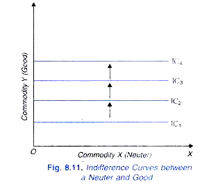
A commodity can be neuter (or a neutral good) in which case the consumer does not care whether he has more or less of that commodity. That is, more or less of a neuter does not affect his satisfaction in any way. If a commodity X is a neuter good and Y a normal good, then indifference curves will be horizontal lines as depicted in Figure 8.11 and the direction of preference will be upward to the north indicating thereby that the higher level of indifference curve will mean higher level of satisfaction because upward movement will mean a ‘good’ commodity is increasing, the quantity of a neuter good remaining the same.
ADVERTISEMENTS:
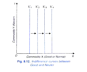
On the other hand, if commodity Y is neuter, while commodity X is good or normal, then indifference curves will be vertical straight lines as depicted in Figure 8.12. The direction of preference in this case will be towards the east (i.e. rightward).
Satiation and Point of Bliss:
Our observations in the real world tell us that a commodity can be good only up to a point called the point of satiation and becomes bad for a consumer if he is forced to increase his consumption beyond that point. There is a combination or bundle of the commodities which contains the optimal or most preferred quantities of the commodities for a consumer and any increase in the quantity of each of them beyond that best or optimal quantity will make the consumer worse off (that is, reduce his satisfaction), quantities of other commodities remaining the same. Too much of everything is bad.
ADVERTISEMENTS:
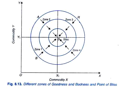
Therefore, commodity X becomes bad beyond the quantity X1 and commodity Y becomes bad beyond the quantity Y1. Two goods case is represented in Figure 8.13 where the circular indifference curves between the two commodities X and Y are drawn. Suppose X1 and Y1 are the quantities of two commodities which the consumer considers as the best or optimal quantities beyond which the two commodities become bad.
Point S represents these most preferred quantities of the two commodities and is therefore the point of satiation or bliss. In zone 1, the portions of indifference curves between the two commodities have negative slope and, therefore, the two commodities are good in this zone.
Let us now consider point A in zone 2 which contains more of Y than regarded optimal or best by our consumer. Therefore, in order to keep his satisfaction constant, he has to be compensated by increase in the quantity of X (Note that in zone 2 the quantity of X remains less than X and increase in its quantity is desirable and adds to his satisfaction. In zone 2, indifference curves have positive slope and here while commodity X is too little, the commodity Y is too much.
Therefore, in zone 2, the commodity y becomes bad while the commodity X remains good. It may be further noted that as the consumer moves toward the point S or his indifference curves approach closer to this point, his satisfaction is increasing and at point S of satiation his satisfaction is maximum. Satiation point S is also called the point of bliss.
Now, consider point R on indifference curve IC1 in zone 3 in which indifference curves have also negative slope. As the consumer moves from point R to S, the quantities of both the commodities decrease but he reaches nearer to the point S of his satiation or bliss. In this case both the commodities are bad. The sum and substance of the whole matter is that as a consumer moves nearer to his most preferred combination S, his satisfaction increases.
In zone 4, whereas the commodity X is more than the desirable quantity X1, the quantity of commodity Y is less than its optimal quantity. Indifference curves in this region are positively sloping indicating that, commodity X being bad in this region increase in its quantity has to be compensated by the increase in the quantity of Y which is desirable in this region to keep the level of consumer’s satisfaction constant.
It follows from above that a consumer has some optimal or most preferred combination of commodities and closer he is to that combination, the better off he is. The combinations of two commodities, say chocolate and ice cream, which are nearer to the point of satiation or bliss point, lie on higher indifference curves and the combinations lying further away from the satiation point, would lie on lower indifference curves. There will be some optimal combination of chocolate and ice cream which a consumer would like to eat per week. Consumers would not voluntarily like to consume too much of them, that is, more than what they want.
Thus, the interesting and relevant region for consumer’s choice of commodities is where he has less than optimal quantities of both these commodities. In Figure 8.13 this region is represented by zone 1 in which the consumer has less of the two goods than he wants and therefore increase in the quantities of the two goods in this region will cause increase in his satisfaction and will move him nearer to the point of satiation.
