In this article we will discuss about consumer’s demand curve for normal good, explained with the help of suitable diagrams.
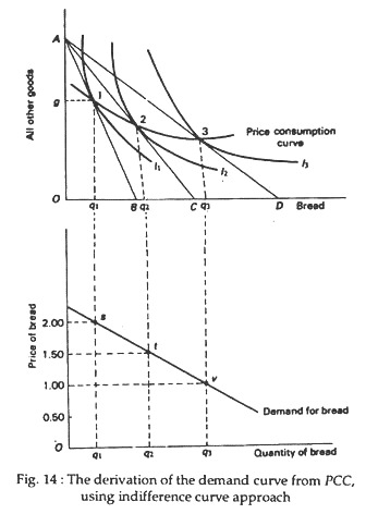
It is easy to show how ordinary demand curves for individual consumers can be constructed from their indifference maps. In Fig. 14 we derive the demand curve of our representative consumer, Ram, for a simple commodity, say bread. In order to do this, we show a composite commodity — consisting of all other goods — on the vertical axis. To be able to derive the demand curve we have to show the quantity of bread demanded at different prices, the prices of all other goods held constant.
The upper portion of Fig. 14 contains Ram’s indifference map. Here, instead of measuring another commodity (a substitute of bread like eggs) we measure the Fig. 14: The derivation of the demand curve from PCC, value of all Other goods using indifference curve approach available on the market (the so-called composite commodity).
ADVERTISEMENTS:
The budget line AB shows that with a fixed money income, Ram can buy either B of bread and nothing else or A of all other goods and no bread. Since money can buy all commodities, the composite commodity shown on the vertical axis may be taken as money. Thus, the quantity A, shown on the vertical axis may be thought of as representing the consumer’s real income. It indicates his purchasing power over all other goods and services.
As usual, we now hold constant Ram’s money income and prices of all goods, except that of bread. This rotates the budget line and makes it flatter. Every time the price of bread is permitted to fall the budget line becomes flatter — it pivots around point A. This enables Ram to reach higher and higher indifference curves and enjoy more and more satisfaction. The locus of successive equilibrium points (i.e., the points of tangency between the budget lines and the indifference curves), we derive the price-consumption curve (PCC).
We may now show the relation between the PCC and the conventional demand curve for bread. Each point on the PCC corresponds to one price of bread and are quantity demanded. In fact, we now need these two pieces of information to be able to derive Ram’s demand curve for bread in the lower part of the diagram. In the horizontal axis of both parts of the diagram we show the quantity of bread.
However, in the vertical axis of the upper part, we measure the quantity of all other goods. In the vertical axis of the lower part we measure the price of bread. Of course, in the upper diagram we can show the price of bread by the slope of the budget line. In the lower diagram, we show the price of bread measured directly on the axis.
Let us now suppose that the budget line AB has a slope which represents a price of Rs. 2 per lb for bread. Ram reaches equilibrium at position 1 on the graph, where indifference curve I1 is tangent to the budget line. At the fixed price, he uses Ag of his income to buy q0 bread (spending Og, therefore, on all other goods).
Now, to derive a point on Mr. X’s demand curve, we have just to plot points in the lower part of the diagram. This point of which correspond to the equilibrium point 1 (in the upper part of the diagram) shows that q1 bread is demanded at a price of Rs 2.00 per lb. As the price of bread falls the budget line becomes flatter. When the price falls first the consumer moves to a new equilibrium point 2.
The corresponding point in the lower diagram is f, which shows that the quantity demanded of bread rises to q1 when price falls to Rs 1.50 per lb. If we carry out the exercise further (by permitting the price of bread to fall again and again) we get points like s, t, v, etc.
Each such point shows a specific quantity that will be demanded at a particular price. The locus of such price-quantity combinations is indeed the demand curve of bread. It shows directly the relationship between prices and quantities of bread demanded.
ADVERTISEMENTS:
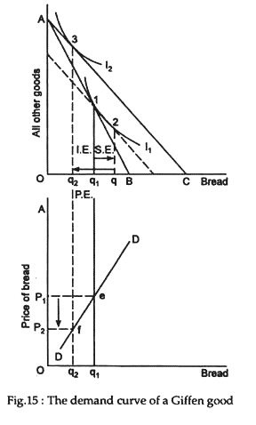
The demand curve that we have derived in Fig. 15 has the normal downward slope, showing larger quantities demanded with falling price. Only in case of Giffen good, when the regular income effect is stronger than the substitution effect, the demand curve would be upward sloping, showing the net purchase of the commodity to fall in the event of a fall in its price. In this case, the demand curve will be upward sloping as shown in Fig. 15.
In this case, the quantity demanded of bread falls from q1 to q2 as its price falls from p1 to p2. This is an important exception to the empirical law of demand and is known as Perverse Demand Relation.

